 When initially brainstorming ideas upon the logo design a variety of different ideas came into mind, firstly through the conventions we saw that the logo will need the main text of our Artist. We have decided to use the art its name glitz as we believe that this best represents out artist. The term is a slang word which represents luxury or glamour, we have decided to use this name also to apply to the codes and conventions of the EDM genre, the use of alan reflect the youthful nature of our target audience and the EDM audience genre in general. We believe this name is effective as it can relate more to our target audience, the name is also short and catchy. This helps the audience to remember the name and is easily pronounced.
 The first image on this page shows the initial idea we had when creating this image, for this image we have used the font "Orator STD" and have placed the font on a white background, with the combination of black colouring we are able to see a sharp contrast in the font and the white background. The longer style of fond allows the reader to easily read the font. The font can also be used on a variety of different computer software which makes it easier for us to develop the font if we later do so in photoshop.
We then decided to us the shape tool to construct a small rectangle to go under the font, we believe that this is used as an exclamation highlighting the name of the artist. The colour of the rectangle is also the colour black, we have chosen this again to match the colour of the main font and the colour scheme we wish to intend to make the logo. We have then used a combination of the rectangle and pen toll to create curves in the shapes. We have started to do this as it will allow us too create words with shoes such as the letter "G","Z" this will allow us to be more creative in the logo construction designing process. The following screen shot shows the progression we have made.

 The following screen shot shows the logo creation taking place, here we are choosing the colours we believe would be effective, the colours that we have chosen are shown at the bottom of the editing page, we have chosen a gold colour as well as the original black colour. We believe that this is a great pairing as the gold colour allows the black to stand out more, when thinking about the ancillary task we are able to identify that we would need a base colour like black for the audience to see the logo, we have decided that the cloud must be either black or white however we believe that black is the best options. We have also only chosen the yellow to only cover the stroke, this makes the colour more subtle however allows the neutral black to stand out more. aster choosing the colours we had the ideas of then making the logo have a drop shadow. The drop shadow effect is very cool and unique, much like the EDM genres audience. We have decided to implement the drop shadow effects as like the stroke the effect with give the logo more charter and a better depth perception, This make the logo more aesthetically pleasing and more enjoyable for the audience to see. As shown in the screen shot to the left there is a substantial different between the first and second drafts of our logo, we believe that the second logo is much more professional and the one that is more likely going to be seen on a existing EDM music artist, the curves are very clean and makes the logo look very crisp and concise. We have decided to join the lettering together, this makes the logo look more unique and interesting, this was a hard task to do as it took a long period of time to achieve this effect using the pen and fill tool.
 Next we decided to use a colour overlay the colour overlay used was a black colour overlay with the effect vivid light over the top, The vivid light effect increases the exposure of the image making the overall colour more lighter, this is effective as it allows the logo to be seen at greater distances and makes the image lees dark when constructing the ancillary tasks this will be beneficial as it allows us too change and edit the background colour of the image to make it fit well and make the logo stand out on the ancillary designs. We have then used a similar tool in the,
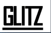
 gradient overlay. The gradient overlay allows the logo to have two separate colours with the top half being the cloud of the original photo and the bottom half being the a colour of the users choice. The angle of which can be changed accord to the users preference, we have ultimately decided to use the colour white as the colour of our choice as this allows the image more depth and makes it look brighter. The gradient overlay is subtle due to us changing the opacity lower to the normal 100%. The logo is now finished in terms of the font and size and shape, however we believe that the logo design will need another image or distinguishing features such as the a smaller image in the logo itself. In the screen shot below you can clearly see that we have created a cower due to the shape tool that is on photoshop. There were several places in which we could have placed this shape however we believed that there instead of using a circle in the letter "I" the image below is the final logo in which we chose to use for our ancillary task and also the social media page.

During this task we were asked to create a social media page for our chosen record label group, we have decided to use the social media site Facebook due to its wide popularity and ease of access, we have also decided to use this as it will allow us to gain first party feedback from our target audience who are mostly lung and therefore familiar with the social media site.
No comments:
Post a Comment